This site is mobile accessible. Press the "Tap Here" button to use a smaller font-size.
Smartphone icons created by Freepik - Flaticon
15.3 CSS MQ Examples
Let us look at some more examples of using media queries. Media queries are a popular technique for delivering a tailored style sheet to different devices. To demonstrate a simple example, we can change the background color for different devices:
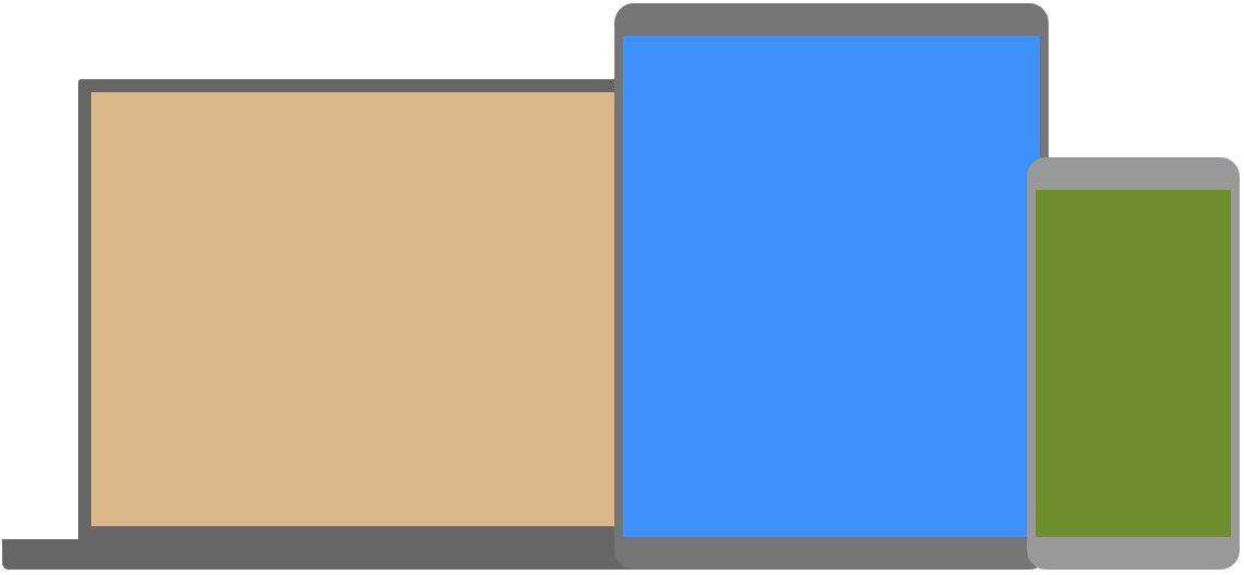
Example 1: Example of using media queries part 1
/* Set the background color of
body to tan */
body {
  background-color: tan;
}

/* On screens that are 992px or less,
 set the background color to blue */
@media screen and (max-width: 992px)
 {
  body {
    background-color: blue;
  }
}

/* On screens that are 600px or less,
  set the background color to olive */
  @media screen and (max-width:
  600px) {
  body {
    background-color: olive;
  }
}
Do you wonder why we use exactly 992px and 600px? They are what we call "typical breakpoints" for devices. You can read more about typical breakpoints in our Responsive Web Design Tutorial.
Media Queries For Menus
In this example, we use media queries to create a responsive navigation menu, that varies in design on different screen sizes.
Example 2: Example of using media queries part 2
/* The navbar container */
.topnav {
  overflow: hidden;
  background-color: #333;
}

/* Navbar links */
.topnav a {
  float: left;
  display: block;
  color: white;
  text-align: center;
  padding: 14px 16px;
  text-decoration: none;
}

/* On screens that are 600px wide
or less, make the menu links stack
on top of each other instead of
next to each other */
@media screen and (max-width: 600px)
{
  .topnav a {
    float: none;
    width: 100%;
  }
}
Media Queries For Columns
A common use of media queries, is to create a flexible layout. In this example, we create a layout that varies between four, two and full-width columns, depending on different screen sizes:
Example 3: Example of using media queries part 3
/* Create four equal columns that
 floats next to each other */
.column {
  float: left;
  width: 25%;
}

/* On screens that are 992px wide
 or less, go from four columns to
 two columns */
 @media screen and (max-width:
         992px) {
  .column {
    width: 50%;
  }
}

/* On screens that are 600px wide
 or less, make the columns stack
 on top of each other instead of
 next to each other */
 @media screen and (max-width:
         600px) {
  .column {
    width: 100%;
  }
}
Tip: A more modern way of creating column layouts, is to use CSS Flexbox (see example below). However, it is not supported in Internet Explorer 10 and earlier versions. If you require IE6-10 support, use floats (as shown above). To learn more about the Flexible Box Layout Module, read our CSS Flexbox chapter. To learn more about Responsive Web Design, read our Responsive Web Design Tutorial.
Example 4: Example of using media queries part 4
/* Container for flexboxes */
.row {
  display: flex;
  flex-wrap: wrap;
}

/* Create four equal columns */
.column {
  flex: 25%;
  padding: 20px;
}

/* On screens that are 992px wide or less, go from four columns to two columns */
@media screen and (max-width: 992px) {
  .column {
    flex: 50%;
  }
}

/* On screens that are 600px wide or less, make the columns stack on top of each other instead of next to each other */
@media screen and (max-width: 600px) {
  .row {
    flex-direction: column;
  }
}
Hide Elements With Media Queries
Another common use of media queries, is to hide elements on different screen sizes:
I will be hidden on small screens.
Example 5: Example of using media queries part 5
/* If the screen size is 600px wide
or less, hide the element */
@media screen and
  (max-width: 600px) {
  div.example {
    display: none;
  }
}
Change Font Size With Media Queries
You can also use media queries to change the font size of an element on different screen sizes:
Example 6: Example of using media queries part 6
/* If screen size is more than 600px wide, set the font-size of <div> to 80px */
@media screen and (min-width: 600px) {
  div.example {
    font-size: 80px;
  }
}

/* If screen size is 600px wide, or less, set the font-size of <div> to 30px */
@media screen and (max-width: 600px) {
  div.example {
    font-size: 30px;
  }
}
Flexible Image Gallery
In this example, we use media queries together with flexbox to create a responsive image gallery:
Example 7: Example of using media queries part 7
* {
  box-sizing: border-box;
}

body {
  margin: 0;
  font-family: Arial;
}

.header {
  text-align: center;
  padding: 32px;
}

.row {
  display: flex;
  flex-wrap: wrap;
  padding: 0 4px;
}

/* Create four equal columns that sits next to each other */
.column {
  flex: 25%;
  max-width: 25%;
  padding: 0 4px;
}

.column img {
  margin-top: 8px;
  vertical-align: middle;
}

/* Responsive layout - makes a two column-layout instead of four columns */
@media screen and (max-width: 800px) {
  .column {
    flex: 50%;
    max-width: 50%;
  }
}

/* Responsive layout - makes the two columns stack on top of each other instead of next to each other */
@media screen and (max-width: 600px) {
  .column {
    flex: 100%;
    max-width: 100%;
  }
}
Flexible Website
Example 8: Example of using media queries part 8
* {
  box-sizing: border-box;
}

/* Style the body */
body {
  font-family: Arial;
  margin: 0;
}

/* Header/logo Title */
.header {
  padding: 60px;
  text-align: center;
  background: #1abc9c;
  color: white;
}

/* Style the top navigation bar */
.navbar {
  display: flex;
  background-color: #333;
}

/* Style the navigation bar links */
.navbar a {
  color: white;
  padding: 14px 20px;
  text-decoration: none;
  text-align: center;
}

/* Change color on hover */
.navbar a:hover {
  background-color: #ddd;
  color: black;
}

/* Column container */
.row {
  display: flex;
  flex-wrap: wrap;
}

/* Create two unequal columns that sits next to each other */
/* Sidebar/left column */
.side {
  flex: 30%;
  background-color: #f1f1f1;
  padding: 20px;
}

/* Main column */
.main {
  flex: 70%;
  background-color: white;
  padding: 20px;
}

/* Fake image, just for this example */
.fakeimg {
  background-color: #aaa;
  width: 100%;
  padding: 20px;
}

/* Footer */
.footer {
  padding: 20px;
  text-align: center;
  background: #ddd;
}

/* Responsive layout - when the screen is less than 700px wide, make the two columns stack on top of each other instead of next to each other */
@media screen and (max-width: 700px) {
  .row, .navbar {
    flex-direction: column;
  }
}
Orientation: Portrait / Landscape
Media queries can also be used to change layout of a page depending on the orientation of the browser. You can have a set of CSS properties that will only apply when the browser window is wider than its height, a so called "Landscape" orientation:
Example 9: Example of using media queries part 9
Use a lightblue background color if the orientation is in landscape mode:
@media only screen and (orientation: landscape) {
  body {
    background-color: lightblue;
  }
}
Min Width to Max Width
You can also use the values to set a minimum width and a maximum width. For example, when the browser's width is between 600 and 900px, change the appearance of a <div>> element:
Example 10: Example of using media queries part 10
@media screen and (max-width: 900px) and (min-width: 600px) {
  div.example {
    font-size: 50px;
    padding: 50px;
    border: 8px solid black;
    background: yellow;
  }
}
Using an additional value: In the example below, we add an additional media query to our already existing one using a comma (this will behave like an OR operator):
Example 11: Example of using media queries part 11
/* When the width is between 600px and 900px OR above 1100px - change the appearance of <div> */
@media screen and (max-width: 900px) and (min-width: 600px), (min-width: 1100px) {
  div.example {
    font-size: 50px;
    padding: 50px;
    border: 8px solid black;
    background: yellow;
  }
}
CSS @media Reference
For a full overview of all the media types and features/expressions, please look at the @media rule in W3Schools.com CSS reference.