This site is mobile accessible. Press the "Tap Here" button to use a smaller font-size.
Smartphone icons created by Freepik - Flaticon
13.1 CSS 2D Transforms
CSS transforms allow you to move, rotate, scale, and skew elements.
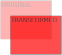
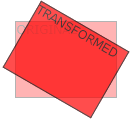
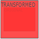
Mouse over the element below to see a 2D transformation:
In this chapter you will learn about the following CSS property:
Browser Support
The numbers in the table specify the first browser version that fully supports the property.
| Property |  |
 |
 |
 |
 |
|---|---|---|---|---|---|
| transform | 36.0 | 10.0 | 16.0 | 9.0 | 23.0 |
CSS 2D Transforms Methods
With the CSS property you can use the following 2D transformation methods:
Tip: You will learn about 3D transformations in the next chapter.
The translate() Method
The method moves an element from its current
position (according to the parameters given for the X-axis and the Y-axis).
The following example moves the <div> element 50 pixels to the right, and
100 pixels down from its current position:
Example 1: The translate() method
div {
  transform: translate(50px, 100px);
}
The rotate() Method
The method rotates an element clockwise or
counter-clockwise according to a given degree.
The following example rotates the <div> element clockwise with 20 degrees:
Example 2: The rotate() method
div {
  transform: rotate(20deg);
}
Using negative values will rotate the element counter-clockwise.
The following example rotates the <div> element counter-clockwise with
20 degrees:
Example 3: The rotate() counter-clockwise method
div {
  transform: rotate(-20deg);
}
The scale() Method
The method increases or decreases the size of
an element (according to the parameters given for the width and height).
The following example increases the <div> element to be two times of its
original width, and three times of its original height:
Example 4: The scale() method
div {
  transform: scale(2, 3);
}
The following example decreases the <div> element to be half of its original width and height:
Example 5: The scale() method
div {
  transform: scale(0.5, 0.5);
}
The scaleX() Method
The method increases or decreases the width
of an element.
The following example increases the <div> element to be two times of its
original width:
Example 6: The scaleX() method
div {
  transform: scaleX(2);
}
The following example decreases the <div> element to be half of its original width:
Example 7: The scaleX() method
div {
  transform: scaleX(0.5);
}
The scaleY() Method
The method increases or decreases the height
of an element.
The following example increases the <div> element to be three times of its
original height:
Example 8: The scaleY() method
div {
  transform: scaleY(3);
}
The following example decreases the <div> element to be half of its original height:
Example 9: The scaleY() method
div {
  transform: scaleY(0.5);
}
The skewX() Method
The method skews an element along the X-axis
by the given angle.
The following example skews the <div> element 20 degrees along the X-axis:
Example 10: The skewX() method
div {
  transform: skewX(20deg);
}
The skewY() Method
The method skews an element along the Y-axis
by the given angle.
The following example skews the <div> element 20 degrees along the Y-axis:
Example 11: The skewY() method
div {
  transform: skewY(20deg);
}
The skew() Method
The method skews an element along the X and
Y-axis by the given angles.
The following example skews the <div> element 20 degrees along the X-axis,
and 10 degrees along the Y-axis:
Example 12: The skew() method
div {
  transform: skew(20deg, 10deg);
}
If the second parameter is not specified, it has a zero value. So, the following example skews the <div> element 20 degrees along the X-axis:
Example 13: The skew() method
div {
  transform: skew(20deg);
}
The matrix() Method
The method combines all the 2D transform
methods into one.
The matrix() method take six parameters, containing mathematic functions, which
allows you to rotate, scale, move (translate), and skew elements.
The parameters are as follow: matrix(scaleX(),skewY(),skewX(),scaleY(),
translateX(),translateY())
Example 14: The matrix() method
div {
  transform: matrix(1, -0.3, 0, 1, 0, 0);
}
CSS Transform Properties
The following table lists all the 2D transform properties:
| Property | Description |
|---|---|
| transform | Applies a 2D or 3D transformation to an element |
| transform-origin | Allows you to change the position on transformed elements |
CSS 2D Transform Methods
| Function | Description |
|---|---|
| matrix(n,n,n,n,n,n) | Defines a 2D transformation, using a matrix of six values |
| translate(x,y) | Defines a 2D translation, moving the element along the X- and the Y-axis |
| translateX(n) | Defines a 2D translation, moving the element along the X-axis |
| translateY(n) | Defines a 2D translation, moving the element along the Y-axis |
| scale(x,y) | Defines a 2D scale transformation, changing the elements width and height |
| scaleX(n) | Defines a 2D scale transformation, changing the element's width |
| scaleY(n) | Defines a 2D scale transformation, changing the element's height |
| rotate(angle) | Defines a 2D rotation, the angle is specified in the parameter |
| skew(x-angle,y-angle) | Defines a 2D skew transformation along the X- and the Y-axis |
| skewX(angle) | Defines a 2D skew transformation along the X-axis |
| skewY(angle) | Defines a 2D skew transformation along the Y-axis |