Main Content
This site is mobile accessible. Press the "Tap Here" button to use a smaller font-size.
Smartphone icons created by Freepik - Flaticon
5.3 HTML Responsive
Responsive web design is about creating web pages that look good on all devices! A responsive web design will automatically adjust for different screen sizes and viewports.
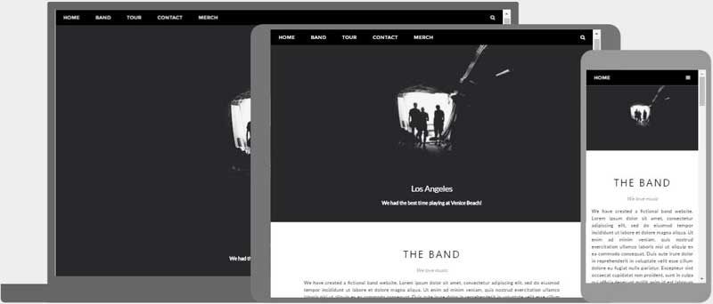
What is Responsive Web Design?
Responsive Web Design is about using HTML and CSS to automatically resize, hide, shrink, or enlarge, a website, to make it look good on all devices (desktops, tablets, and phones):
HTML responsive page
Setting The Viewport
To create a responsive website, add the following tag to all your web pages:
Example 1: HTML viewport
<meta name="viewport" content="width=device-width, initial-scale=1.0">
This will set the viewport of your page, which will give the browser instructions on how to control the page's dimensions and scaling. Here is an example of a web page without the viewport meta tag, and the same web page with the viewport meta tag:

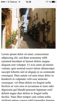
example webpage without viewport <meta> tag
example webpage with viewport <meta> tag
Tip: If you are browsing this page on a phone or a tablet, you can click on the two links above to see the difference.
Responsive Images
Responsive images are images that scale nicely to fit any browser size.
Using the width Property
If the CSS property is set to 100%, the image will be responsive and scale up and down:

Example 2: Responsive image part 1
<img src="img_girl.jpg" style="width:100%;">
Notice that in the example above, the image can be scaled up to be larger than its original size. A better solution, in many cases, will be to use the property instead.
Using the max-width Property
If the property is set to 100%, the image will scale down if it has to, but never scale up to be larger than its original size:
Example 3: Responsive Image part 2
<img src="img_girl.jpg" style="max-width:100%;height:auto;">
Show Different Images Depending on Browser Width
The HTML element allows you to define different images for different browser window sizes. Resize the browser window to see how the image below change depending on the width:

Example 4: HTML picture element
<picture>
  <source srcset="img_smallflower.jpg" media="(max-width: 600px)">
  <source srcset="img_flowers.jpg" media="(max-width: 1200px)">
  <source srcset="flowers.jpg">
  <img src="img_smallflower.jpg" alt="Flowers">
</picture>
Responsive Text Size
The text size can be set with a "vw" unit, which means the "viewport width". That way the text size will follow the size of the browser window:
Resize the browser window to see how the text size scales.
Example 5: Responsive text
<h1 style="font-size:10vw">Hello World</h1>
Viewport is the browser window size. 1vw = 1% of viewport width. If the viewport is 50cm wide, 1vw is 0.5cm.
Media Queries
In addition to resize text and images, it is also common to use media queries in responsive web pages. With media queries you can define completely different styles for different browser sizes. Example: resize the browser window to see that the three div elements below will display horizontally on large screens and stacked vertically on small screens:
Left Menu
Right Content
Example 6: Using media queries part 1
<style>
.left, .right {
  float: left;
  width: 20%; /* The width is 20%, by default */
}

.main {
  float: left;
  width: 60%; /* The width is 60%, by default */
}

/* Use a media query to add a breakpoint at 800px: */
@media screen and (max-width: 800px) {
  .left, .main, .right {
    width: 100%; /* The width is 100%, when the viewport is 800px or smaller */
  }
}
</style>
Responsive Web Page - Full Example
A responsive web page should look good on large desktop screens and on small mobile phones.
Example 7: Using media queries part 2
<!DOCTYPE html>
<html>
<head>
<meta charset="utf-8">
<meta name="viewport" content="width=device-width, initial-scale=1.0">
<title>Using media queries part 2</title>
<style>
* {
  box-sizing: border-box;
}

.menu {
  float: left;
  width: 20%;
  text-align: center;
}

.menu a {
  background-color: #e5e5e5;
  padding: 8px;
  margin-top: 7px;
  display: block;
  width: 100%;
  color: black;
}

.main {
  float: left;
  width: 60%;
  padding: 0 20px;
}

.right {
  background-color: #e5e5e5;
  float: left;
  width: 20%;
  padding: 15px;
  margin-top: 7px;
  text-align: center;
}

@media only screen and (max-width: 620px) {
  /* For mobile phones: */
  .menu, .main, .right {
    width: 100%;
  }
}
</style>
</head>
<body style="font-family:Verdana;color:#aaaaaa;">

<div style="background-color:#e5e5e5;padding:15px;text-align:center;">
  <h1>Hello World</h1>
</div>

<div style="overflow:auto">
  <div class="menu">
    <a href="#">Link 1</a>
    <a href="#">Link 2</a>
    <a href="#">Link 3</a>
    <a href="#">Link 4</a>
  </div>

  <div class="main">
    <h2>Lorum Ipsum</h2>
    <p>Lorem ipsum dolor sit amet, consectetuer adipiscing elit, sed diam nonummy nibh euismod tincidunt ut laoreet dolore magna aliquam erat volutpat.</p>
  </div>

  <div class="right">
    <h2>About</h2>
    <p>Lorem ipsum dolor sit amet, consectetuer adipiscing elit.</p>
  </div>
</div>

<div style="background-color:#e5e5e5;text-align:center;padding:10px;margin-top:7px;">© copyright w3schools.com</div>

</body>
</html>
Responsive Web Design - Frameworks
All popular CSS Frameworks offer responsive design. They are free, and easy to use.
W3.CSS
- W3.CSS is a modern CSS framework with support for desktop, tablet, and mobile design by default
- W3.CSS is smaller and faster than similar CSS frameworks
- W3.CSS is designed to be a high quality alternative to Bootstrap
- W3.CSS is designed to be independent of jQuery or any other JavaScript library
Example 8: Using w3css
To learn more about W3.CSS, read the W3.CSS Tutorial.
Bootstrap
Another popular CSS framework is Bootstrap. Bootstrap uses HTML, CSS and jQuery to make responsive web pages.
Example 9: Using Bootstrap
<!DOCTYPE html>
<html lang="en">
<head>
<title>Bootstrap Example</title>
<meta charset="utf-8">
<meta name="viewport" content="width=device-width, initial-scale=1">
<link rel="stylesheet" href="https://maxcdn.bootstrapcdn.com/bootstrap/3.4.1/css/bootstrap.min.css">
<script src="https://ajax.googleapis.com/ajax/libs/jquery/3.5.1/jquery.min.js"></script>
<script src="https://maxcdn.bootstrapcdn.com/bootstrap/3.4.1/js/bootstrap.min.js"></script>
</head>
<body>

<div class="container">
  <div class="jumbotron">
    <h1>My First Bootstrap Page</h1>
  </div>
  <div class="row">
    <div class="col-sm-4">
      ...
    </div>
    <div class="col-sm-4">
      ...
    </div>
    <div class="col-sm-4">
    ...
    </div>
  </div>
</div>

</body>
</html>